Branding
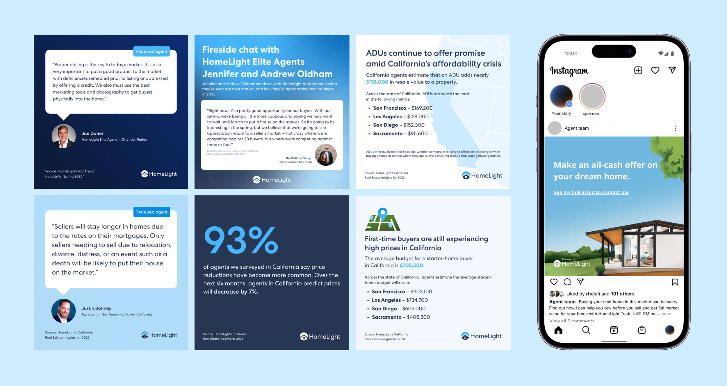
HomeLight is a real estate tech company. Building trust with a customer to get them to buy and sell a home with the click of a mouse, was an interesting challenge for a designer to tackle.
Overview
Due to the serious nature of real estate transactions, the style had to be professional, communicate stories, complex ideas, and spark imagination in a more accessible way.
Align the vision and expectations of all stakeholders as well as offer a unique experience for its users that will increase engagement and attract new users.
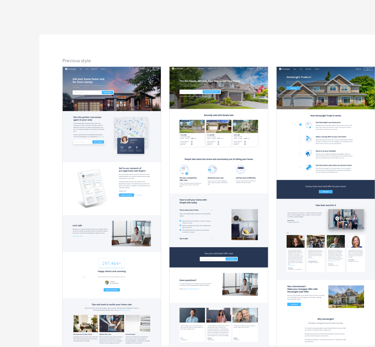
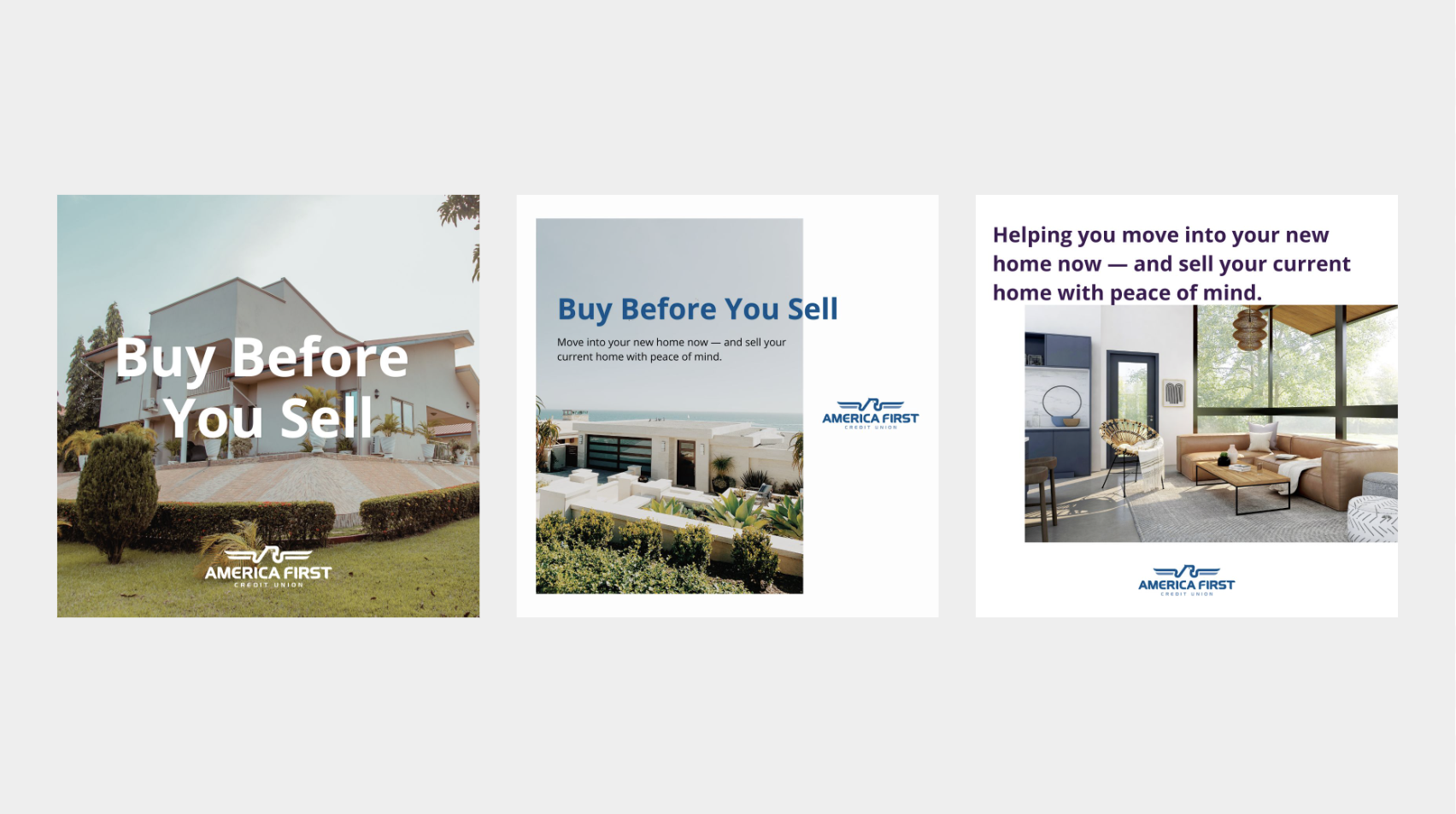
Previous style
I was the visual designer on this project and I partnered up with a product designer and head of design to do A/B testing on the rebranding. I was in charge of coming up with a mood board, researching, and execute on the illustration.
Business discovery/concept testing
Reaching a common understanding:
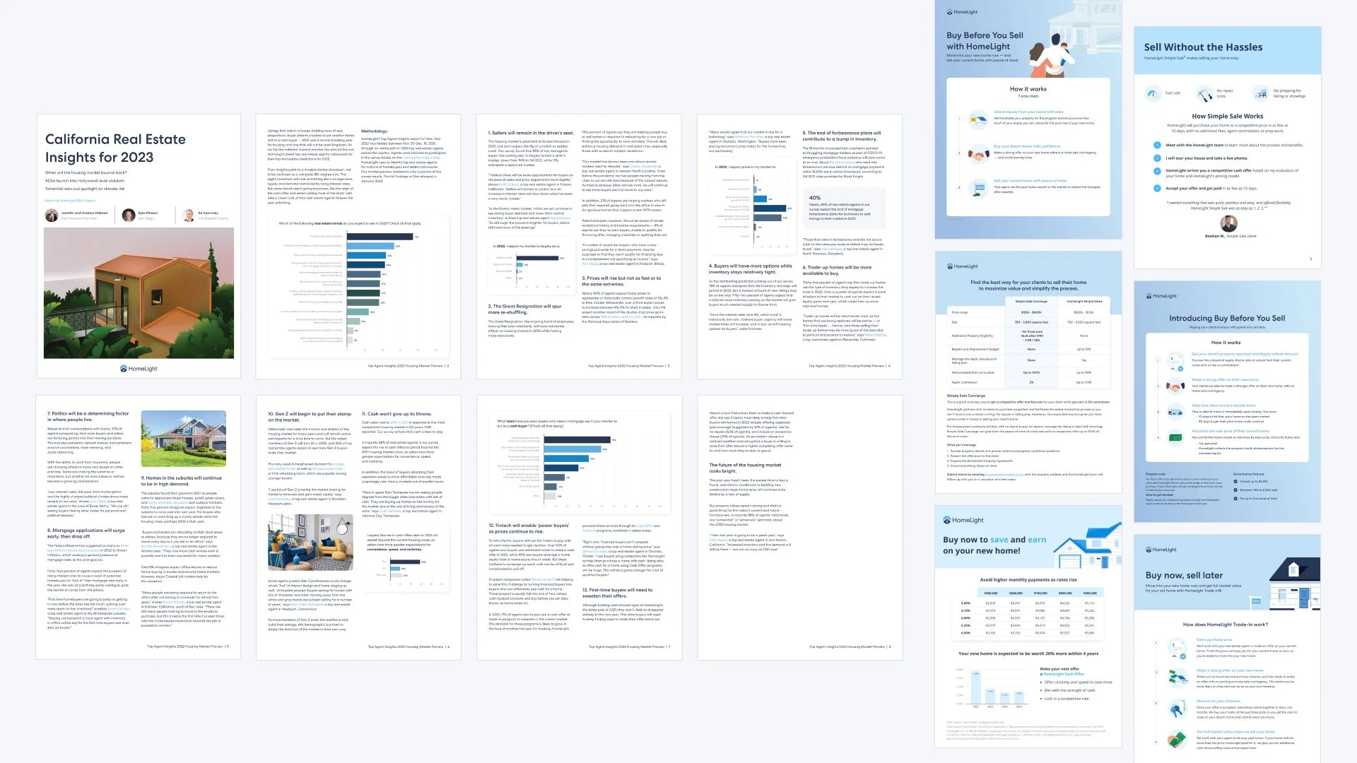
Added new products, and changed our approach to users which resulted in new landing pages.
More competitors come out with similar products but more vibrant visuals, catchy language, and intuitive user experience.
Redefine the brand messaging, tone, and style.
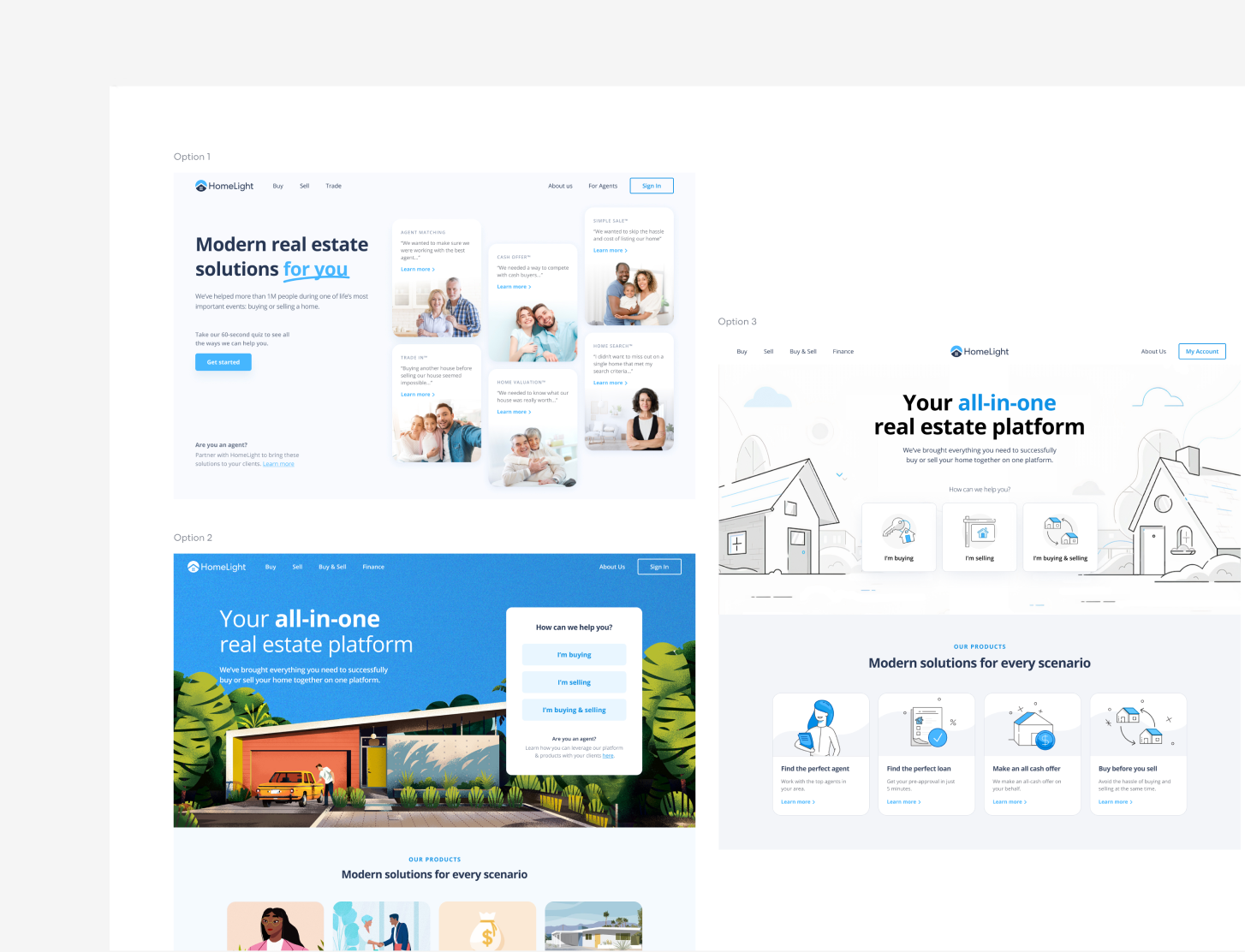
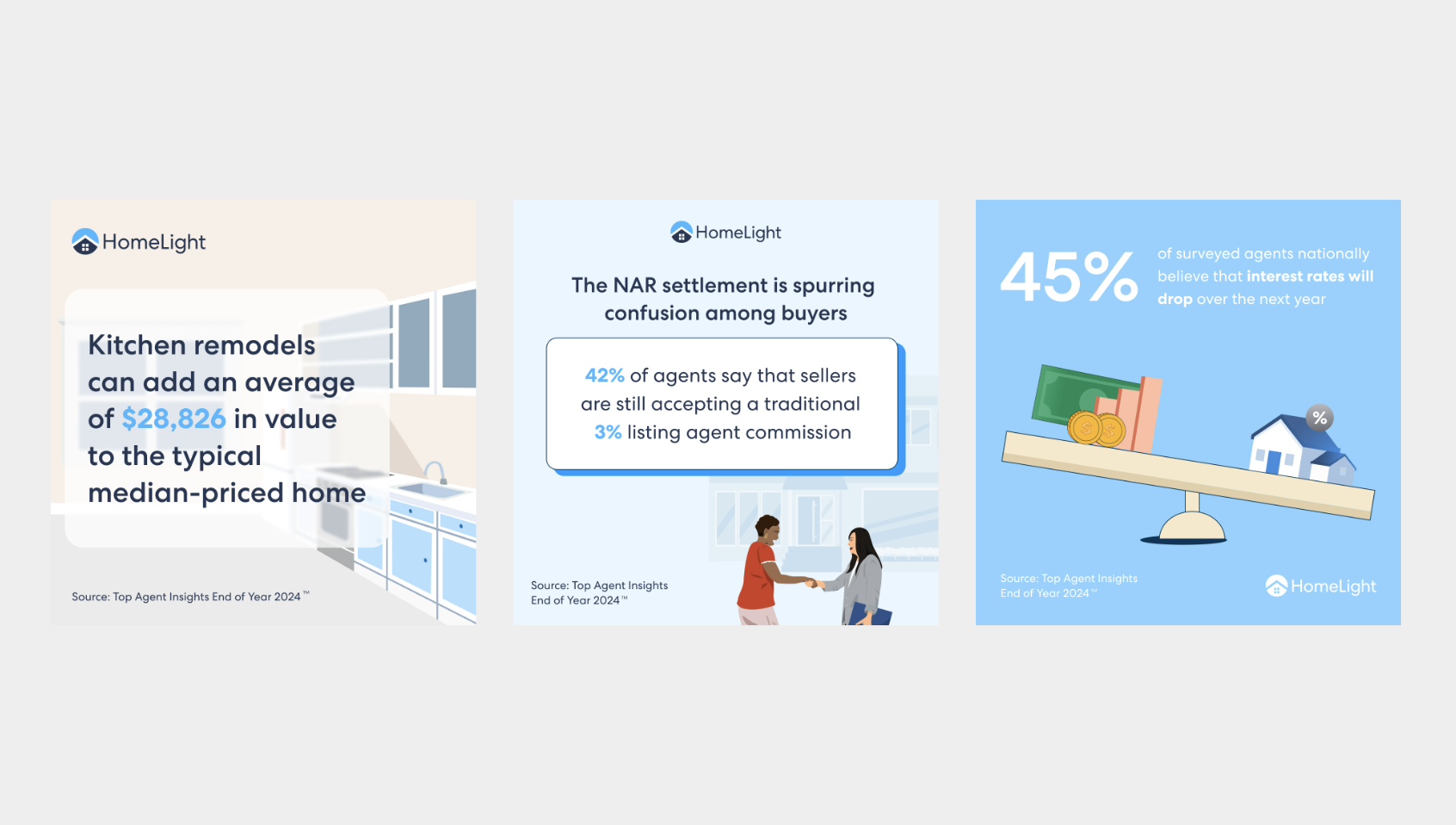
Seek for solutions to differentiate HL from competitors - use illustration, simple modern language, educate users on the buy, sell, buy, and sell process.
Findings
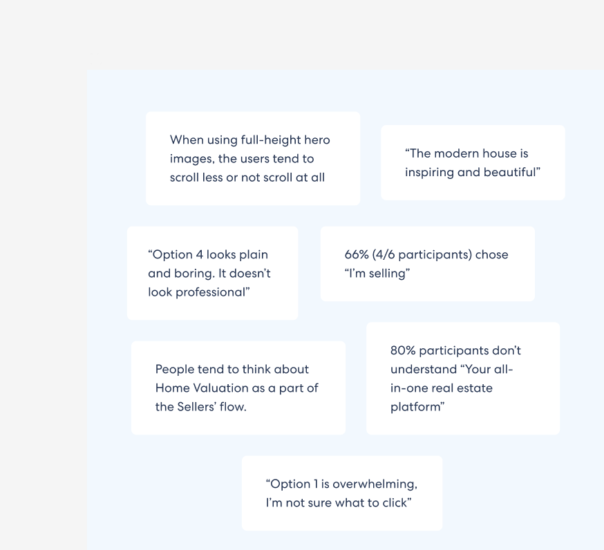
We interviewed 70 users from different industries and locations in the U.S., to validate the main hypothesis of the concept and then the features that we selected.
Do users expect the CTAs to always be on the left? Are three CTAs overwhelming?
Do our keywords speak to our audience's interests and needs? Are they clear enough? Which words do they use to describe what they're seeing?
Is the content clear to the users? How understandable is the information? Are they able to make an informed decision based on what's on the screen?
Goals
User: Real estate agents, consumers, and engineers
Business: Provide a new experience for users and differentiate HL from competitors
Foundations
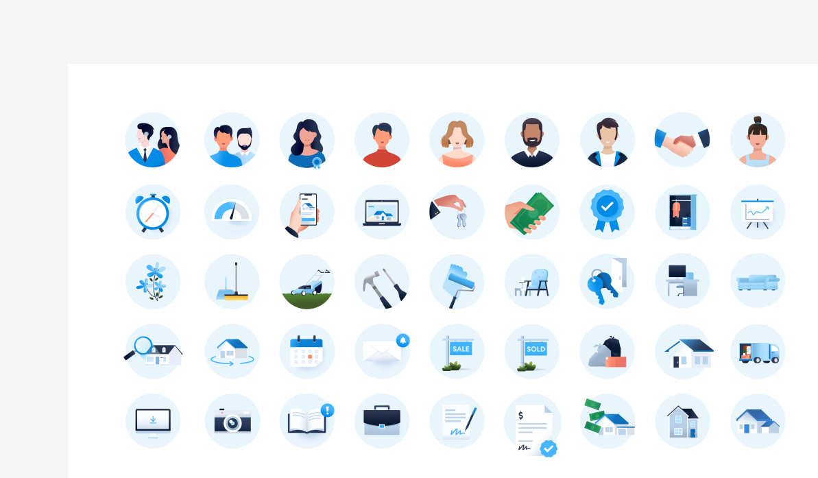
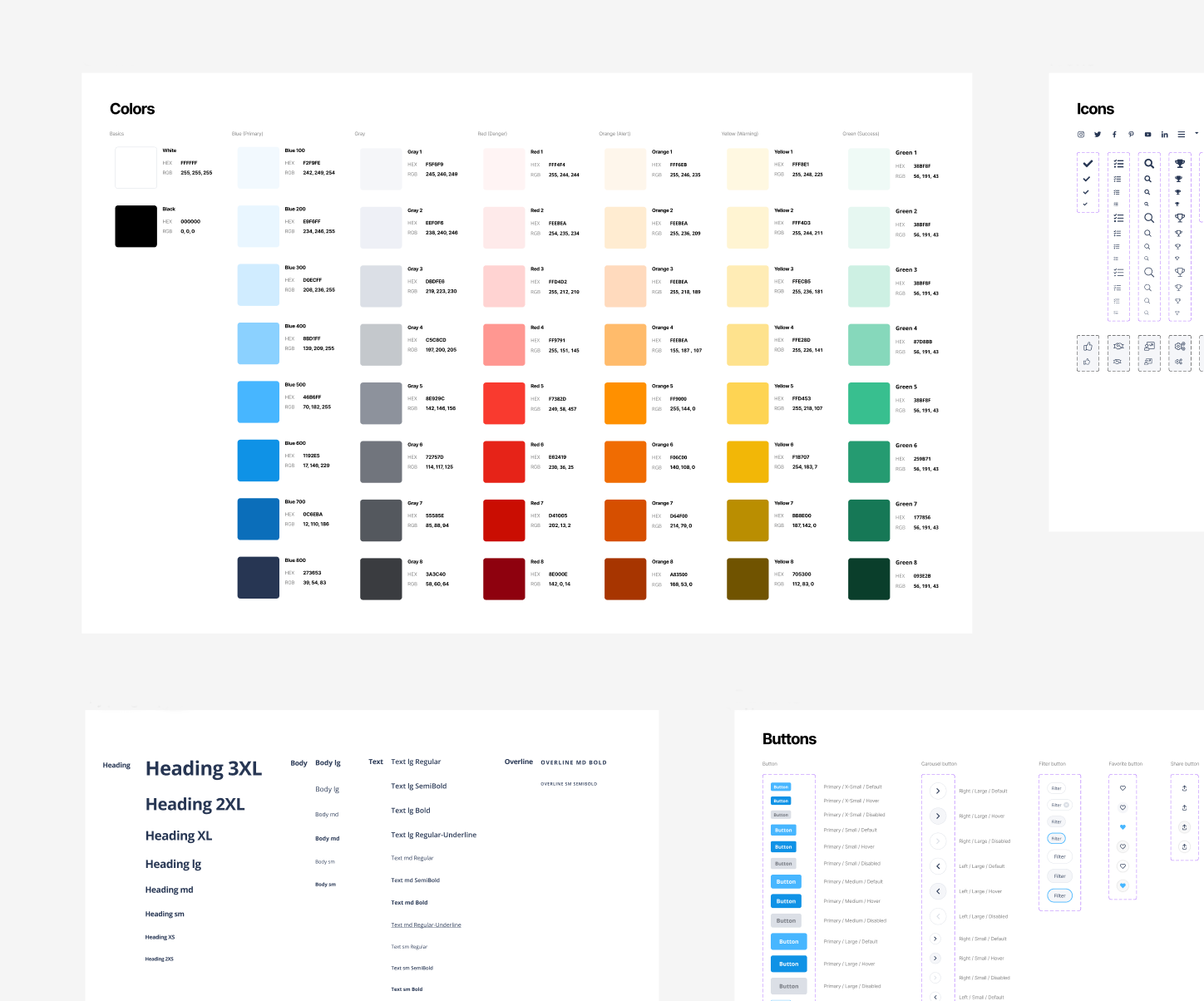
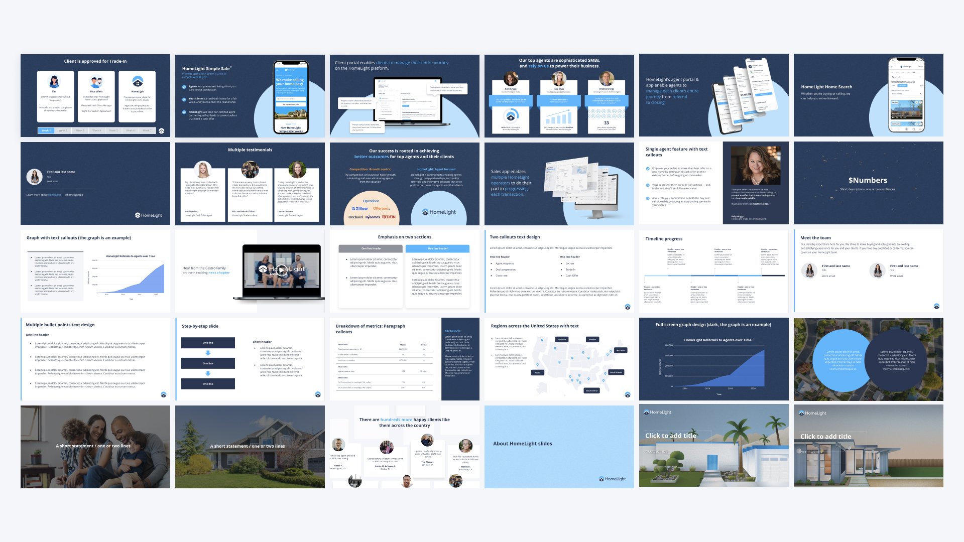
We worked as a team to audit and refine our foundational styles: colors, typography, iconography, etc. We built the design system in Figma to centralize information between engineering, product, design, and marketing. This helped us work more efficiently and improved consistency and quality across multiple teams and applications.
Core characteristics
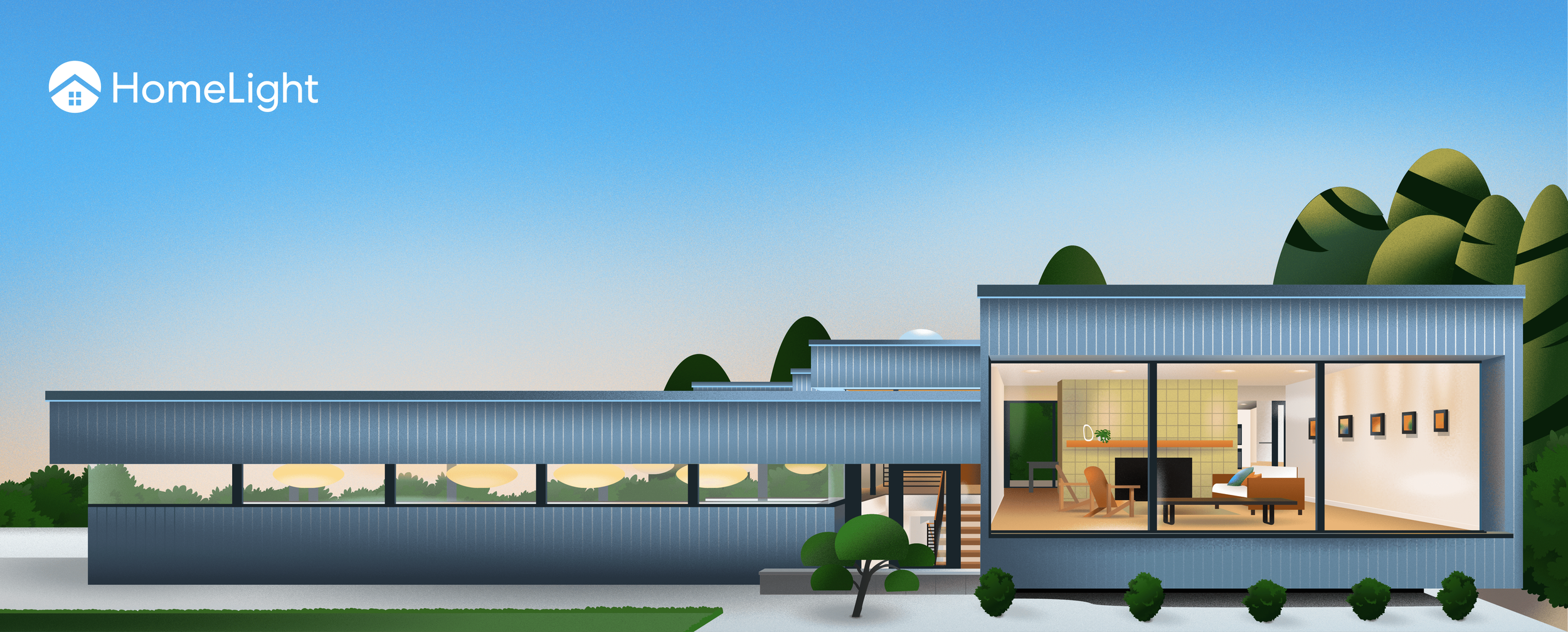
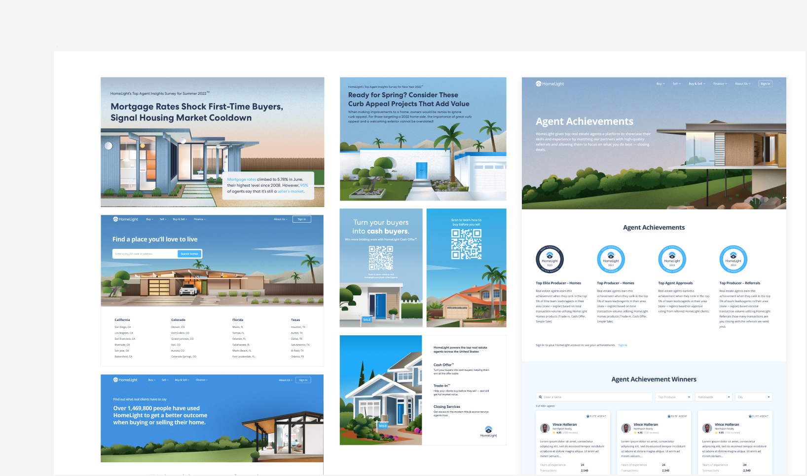
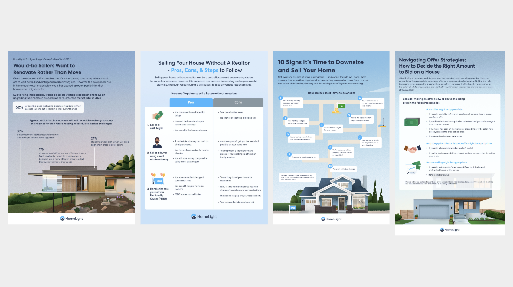
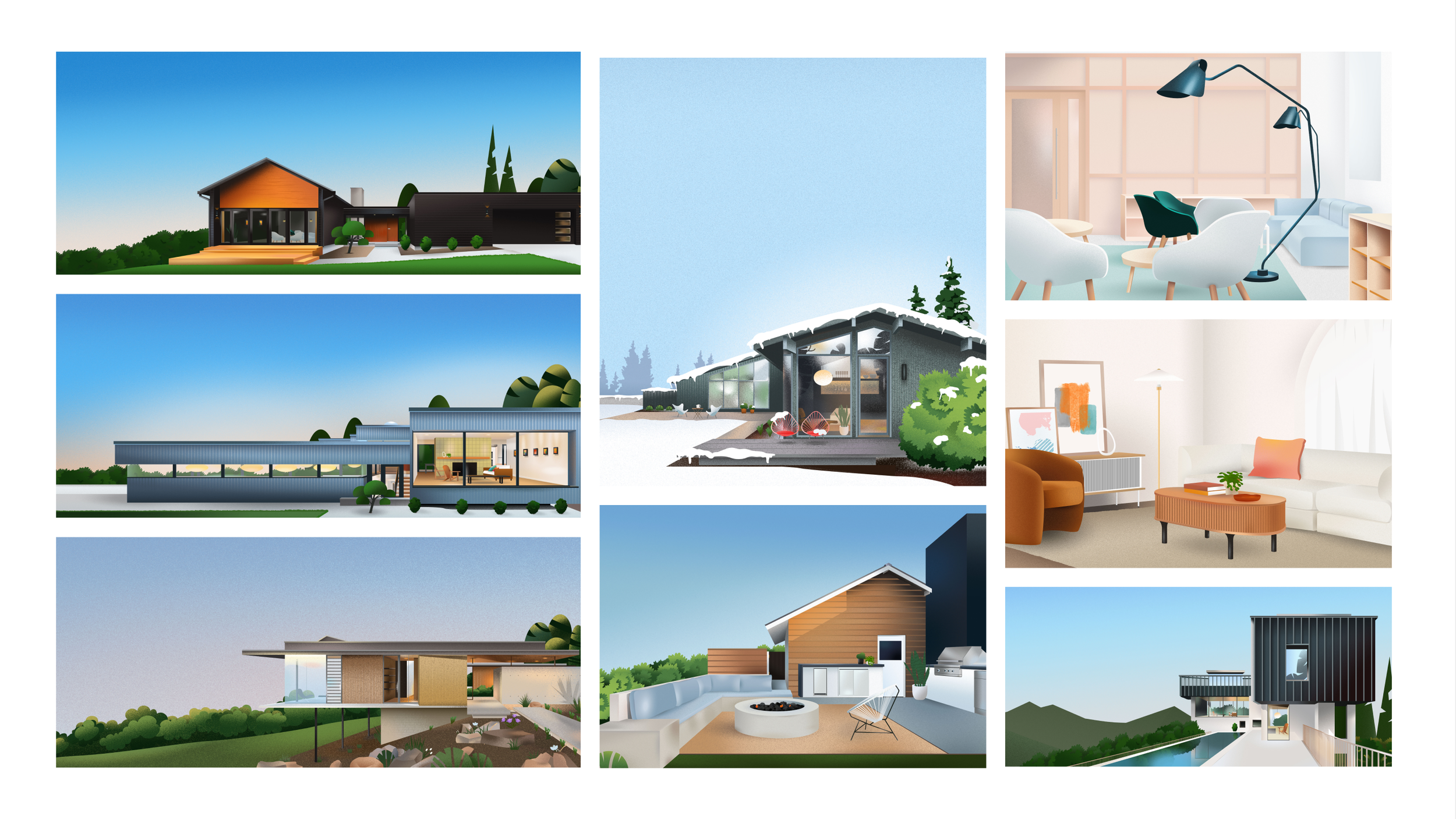
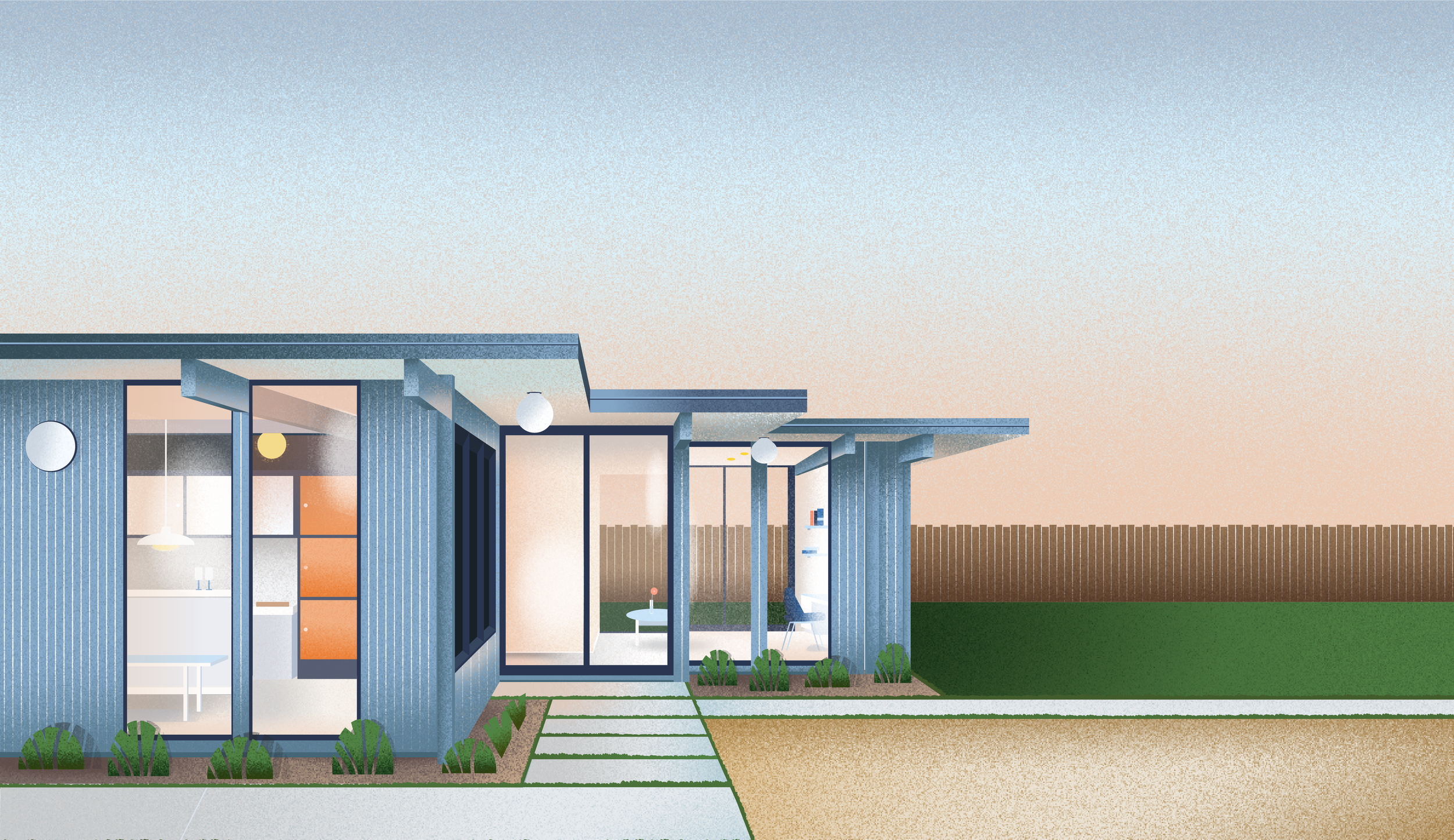
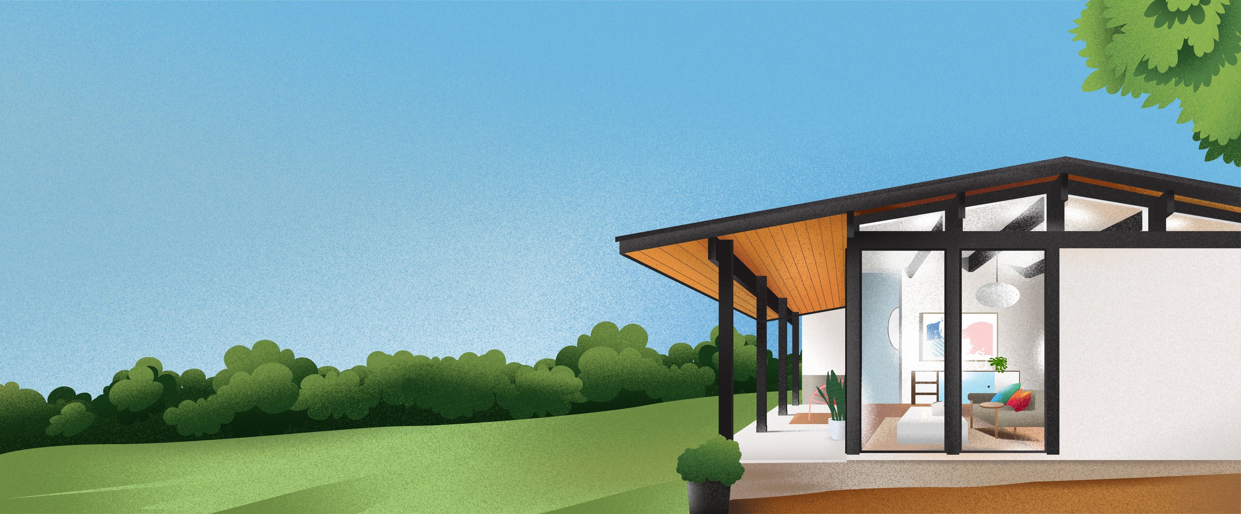
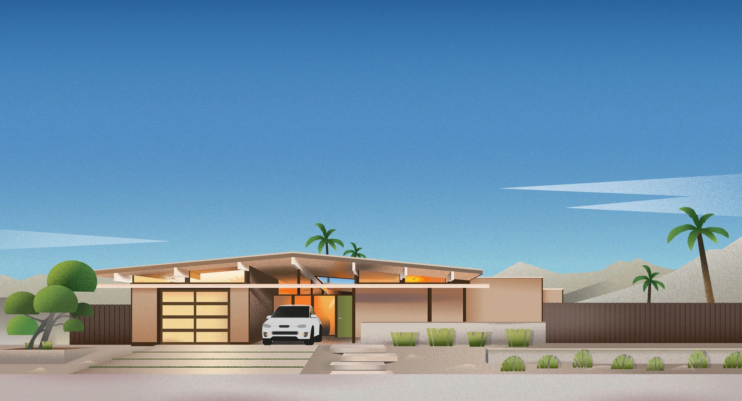
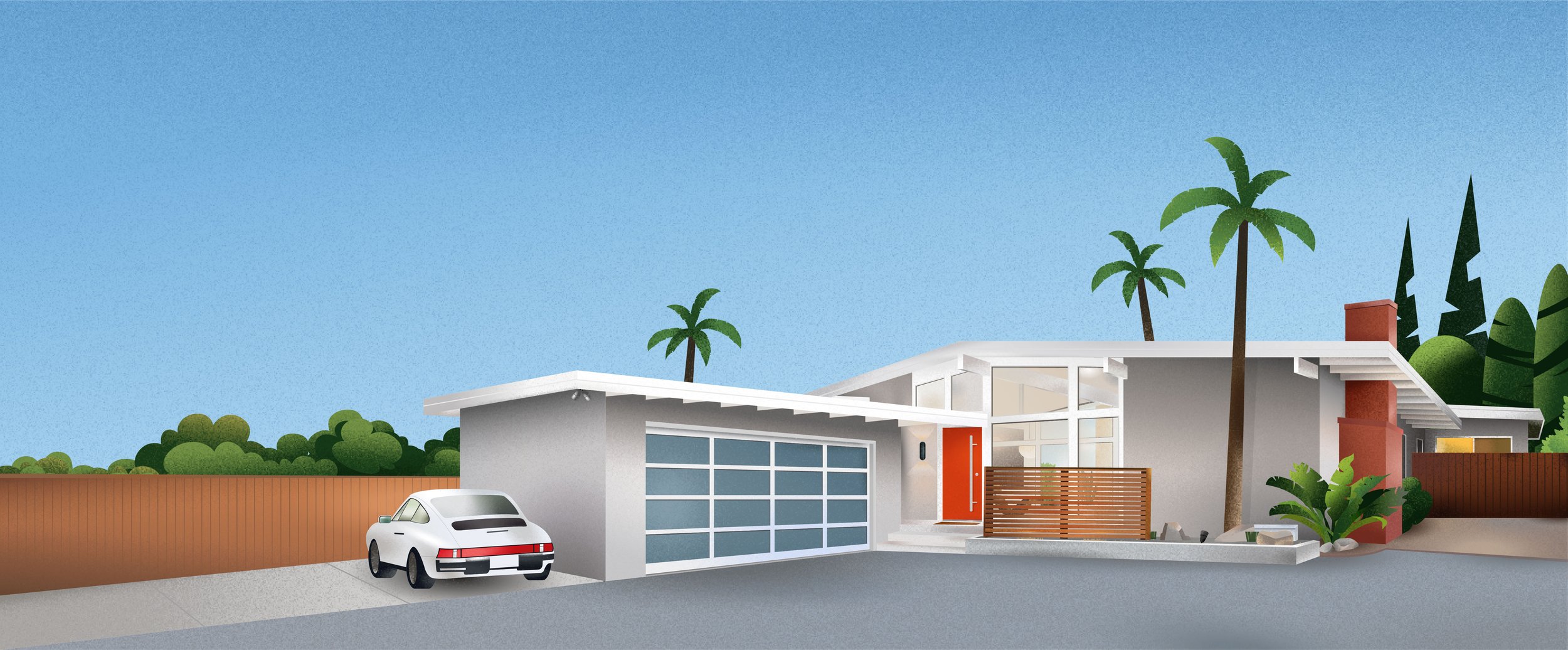
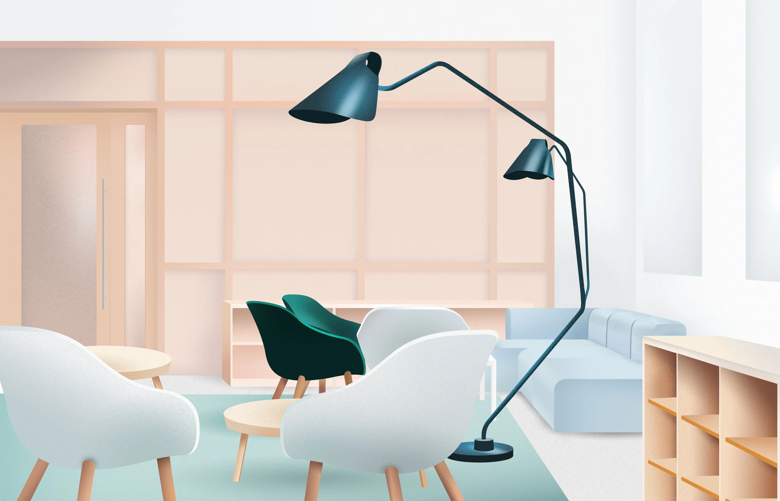
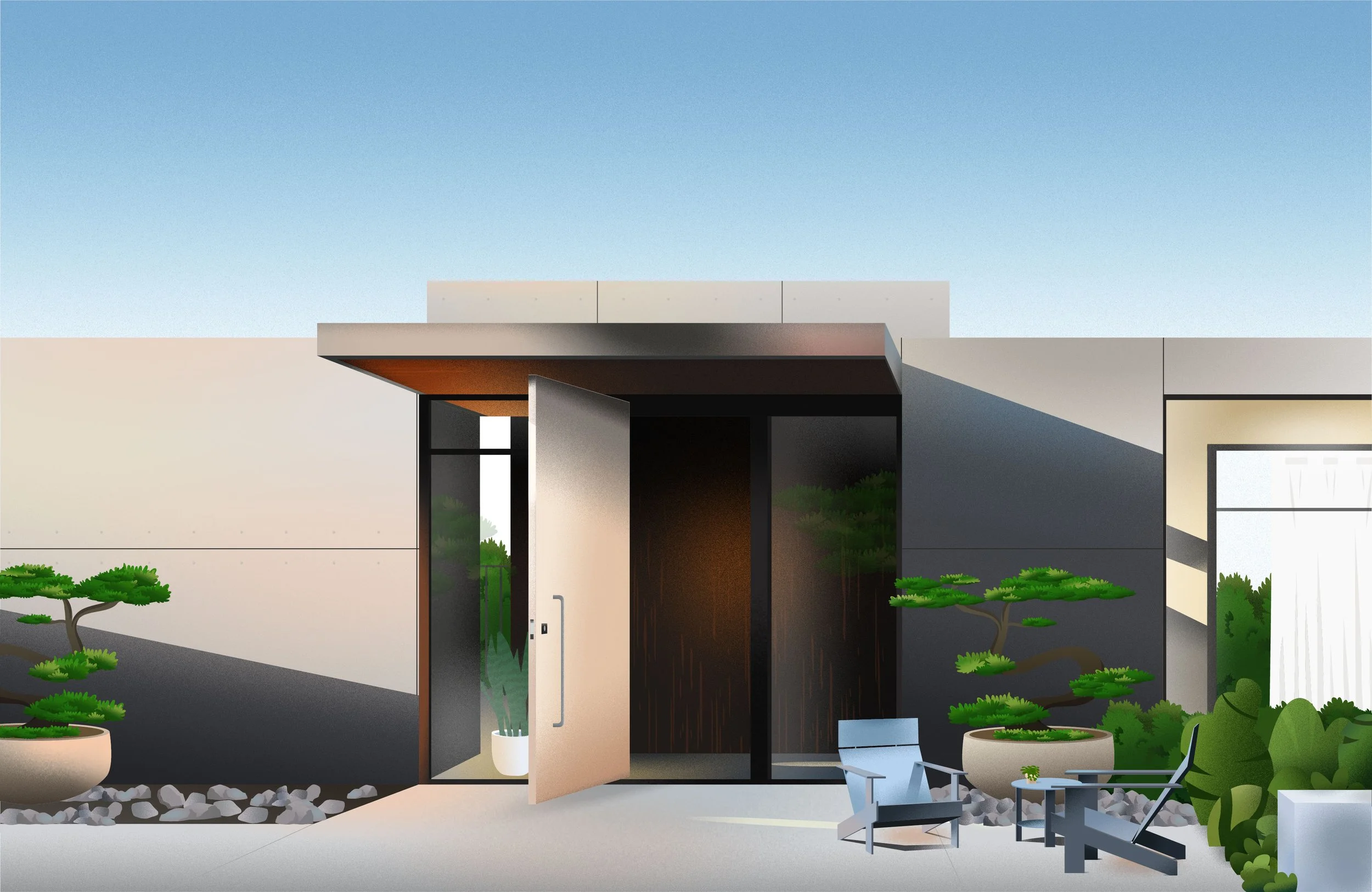
We use texture on many elements in an illustration - wherever light and shadows fall, to give objects depth and contrast.
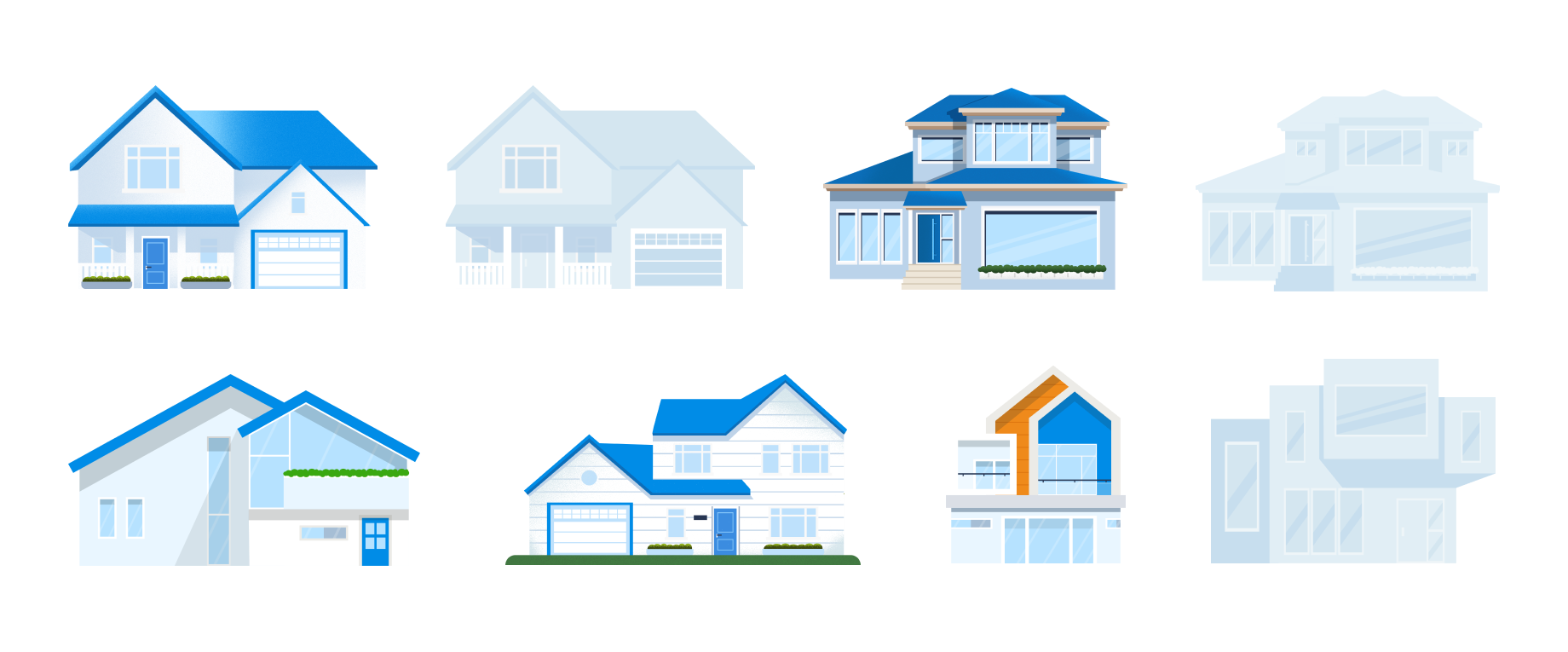
Architectures should look well maintained, realistic in proportion, and have the most attention to detail.
Landscapes and yards complement a scene or home.
Hint at the activity without having many figures in a scene.

