HomeLight Design System Overview
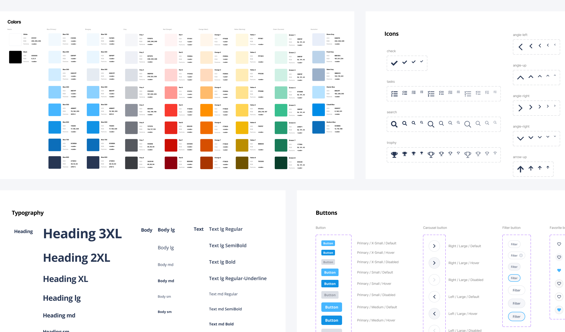
Our team encountered problems with design consistency and quality as we scaled. The design team built a new design system in Figma to centralize information between engineering, product, and design. We brought in a small team of developers to help us plan, scope, and select technologies, and eventually settled on using the Figma Tokens plugin to connect our master component library to GitHub. This helped us work more efficiently and improved consistency and quality across multiple teams and applications.
Foundations
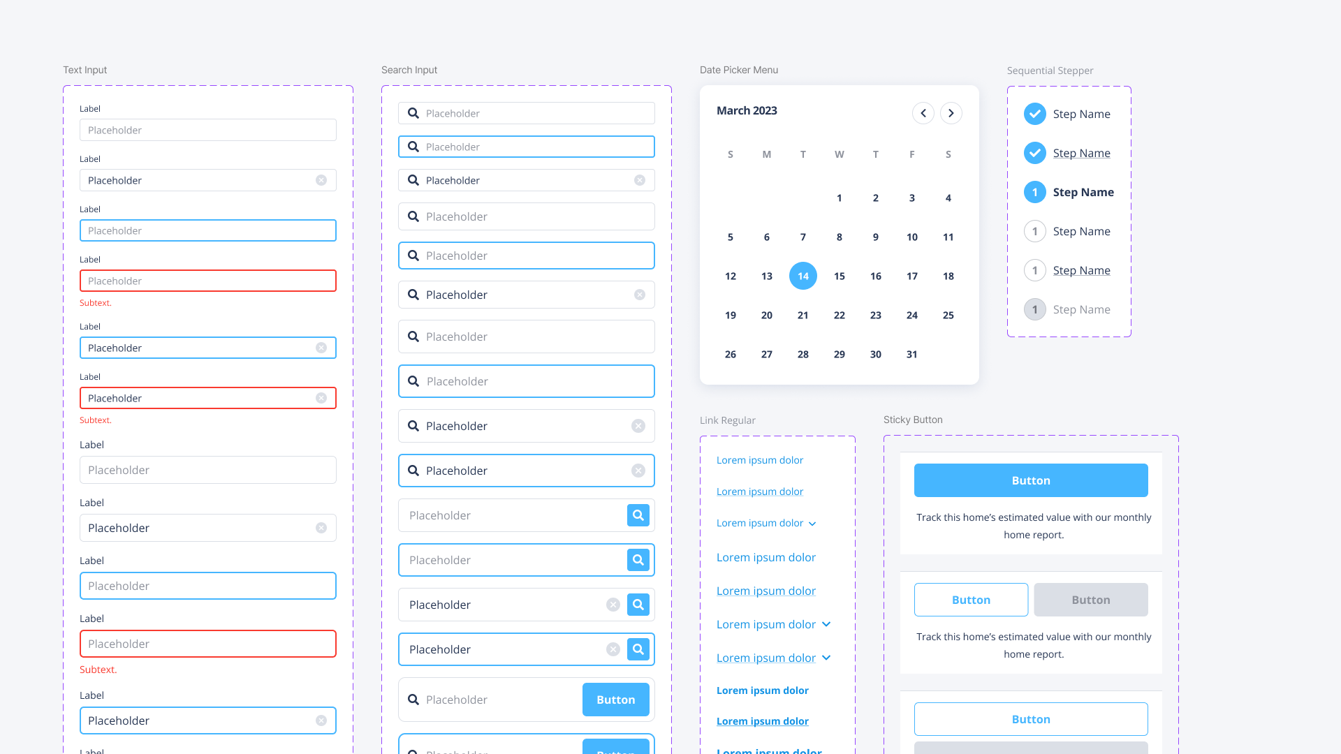
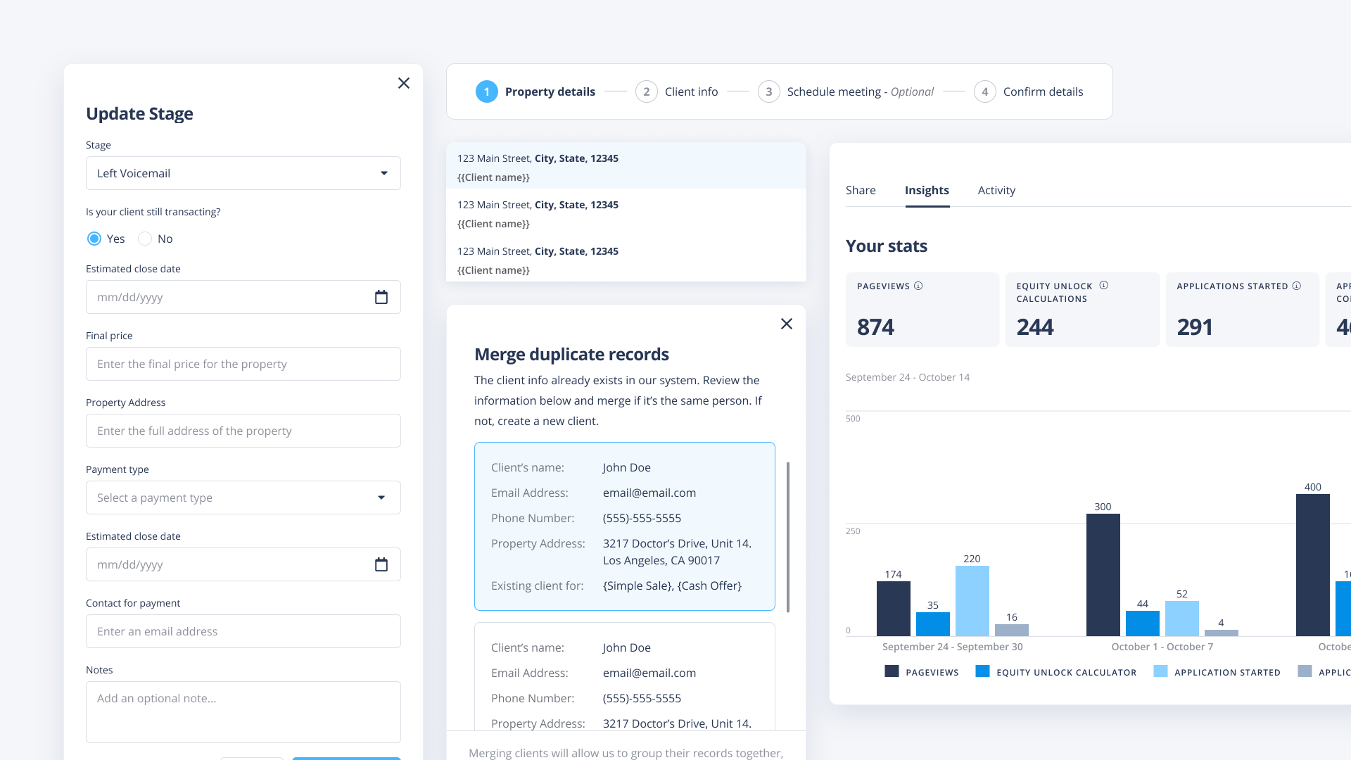
The design team advocated for the business to adopt our Figma design system. For this first version, the team chose to keep it simple and focus on foundations - type, color, buttons, inputs, toasts, etc.
Components
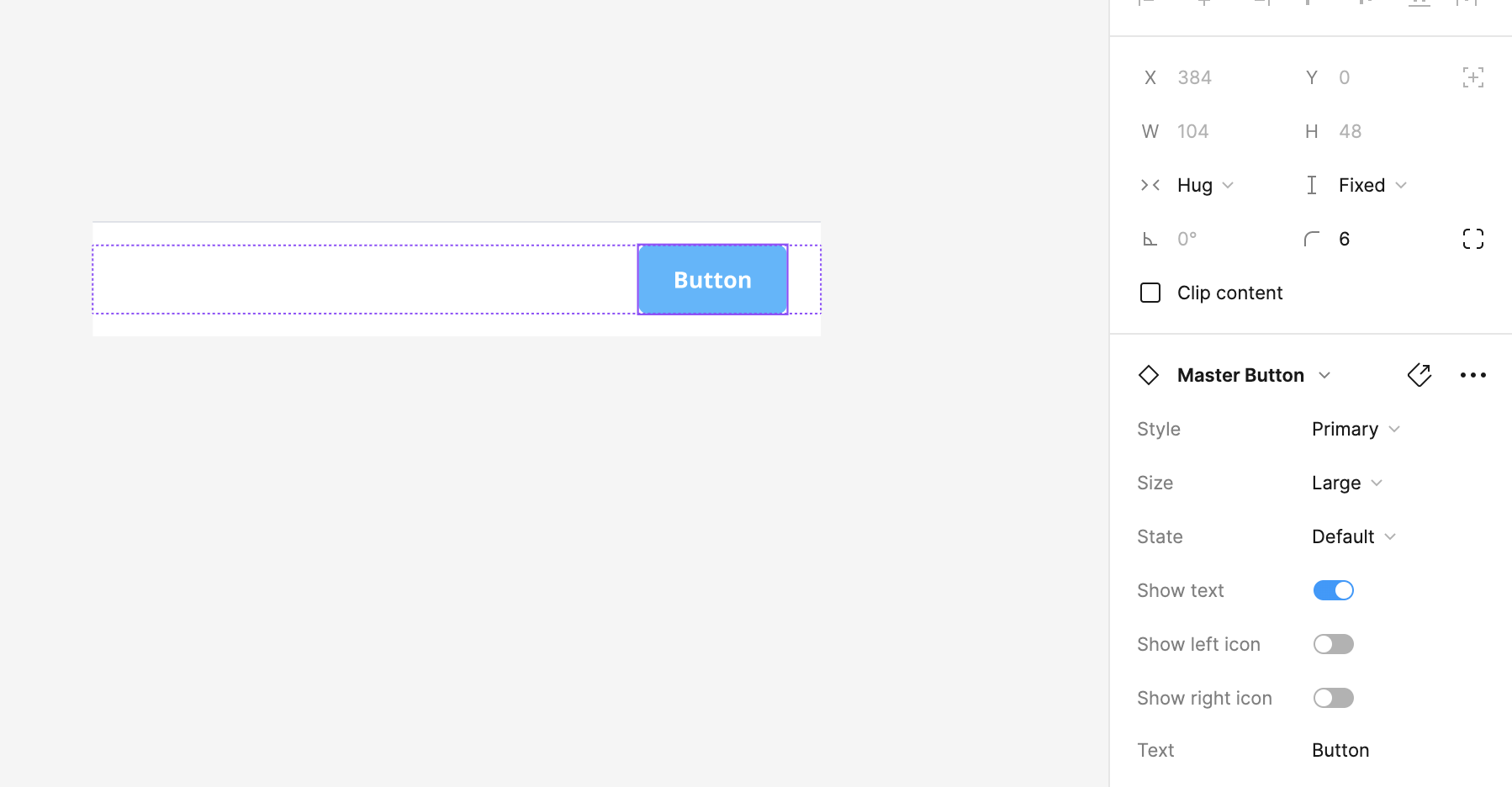
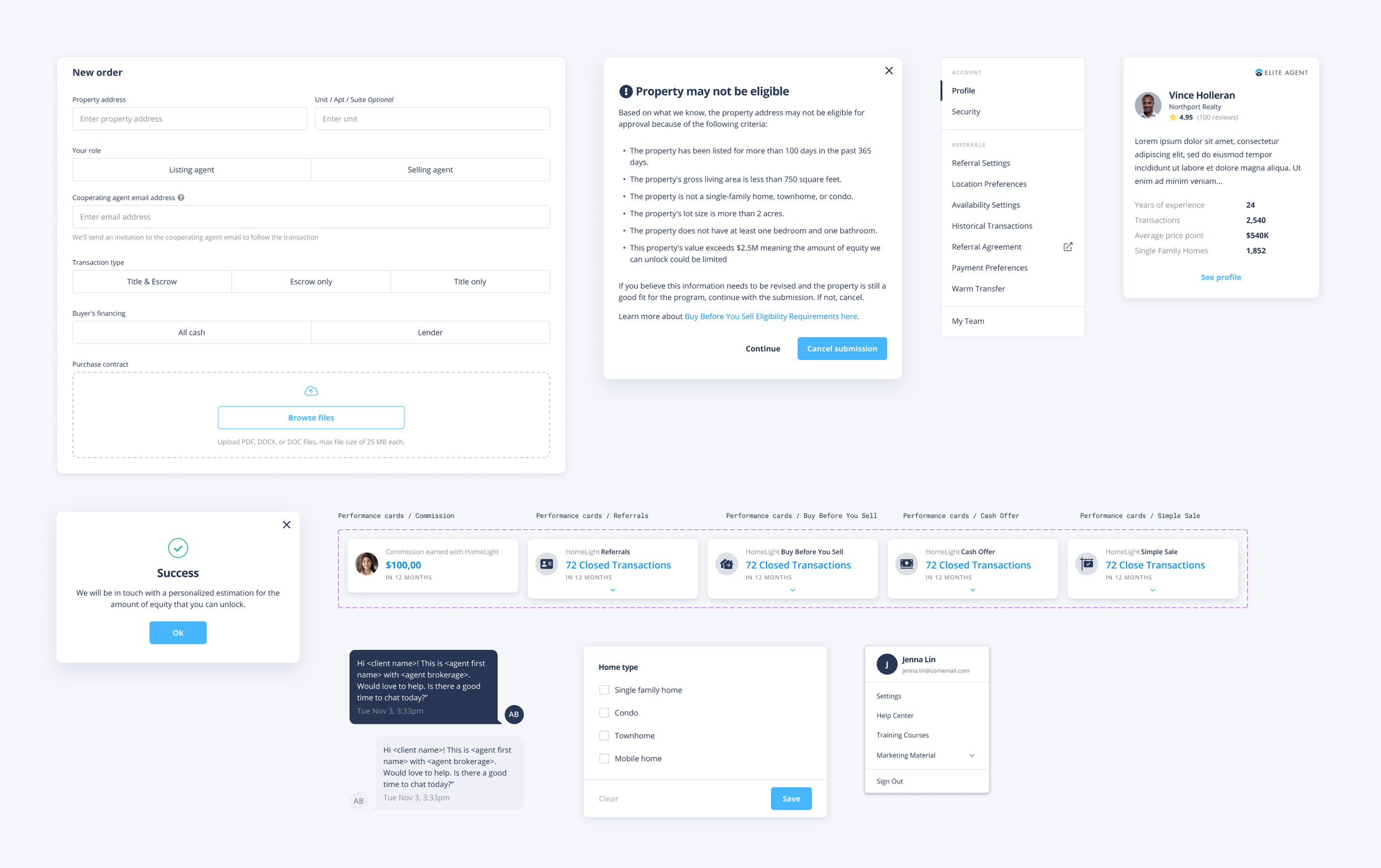
We use features such as component and autolayout to make sure the design is consistent.
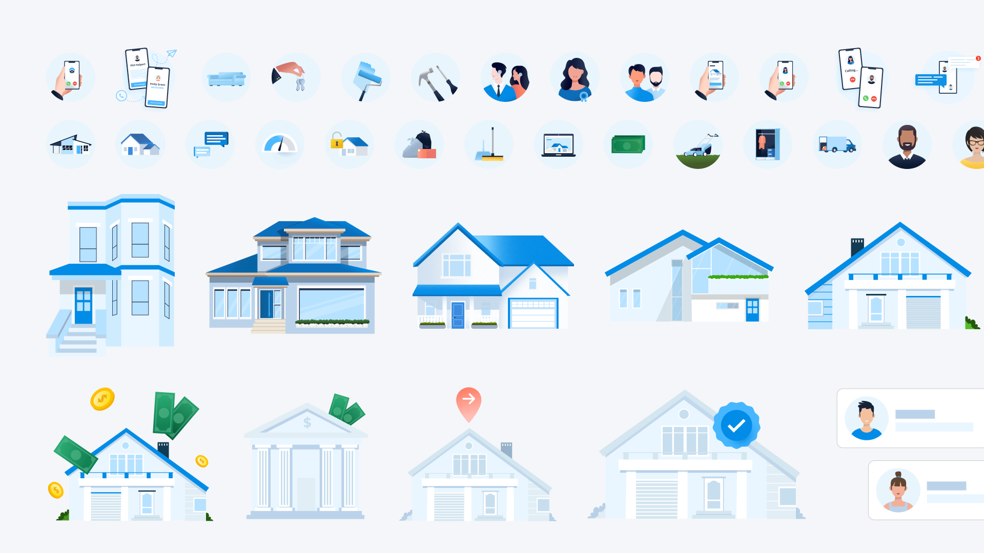
Graphics
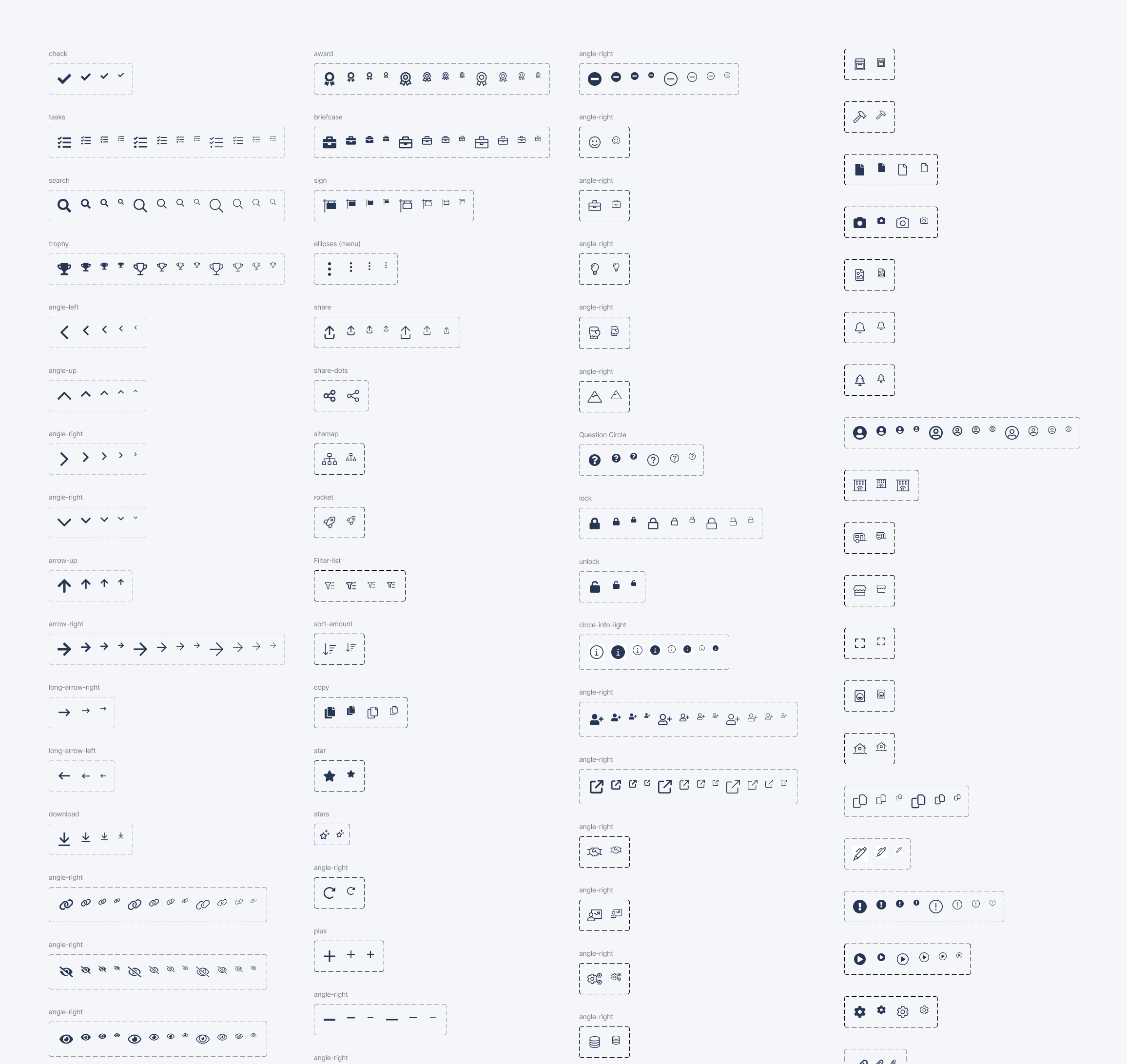
Variations of Illustrated icons and graphics.
Goals
User: Engineers, product managers, and designers to maintain quality UX and UI
Business: Reduce product development inefficiencies to cut down on cost and time
Product: Develop a design system for different platforms
Agent dashboard component library
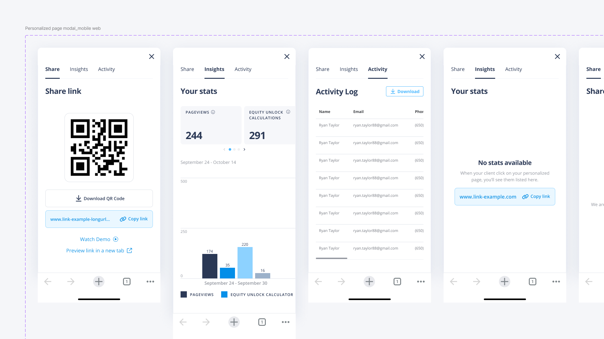
As the company scaled, the design team realized we needed a design system for Agent Dashbaord as well. I worked with another lead designer to build out a more complex library using the “atomic” elements from the master design system.
Agent Dashboard
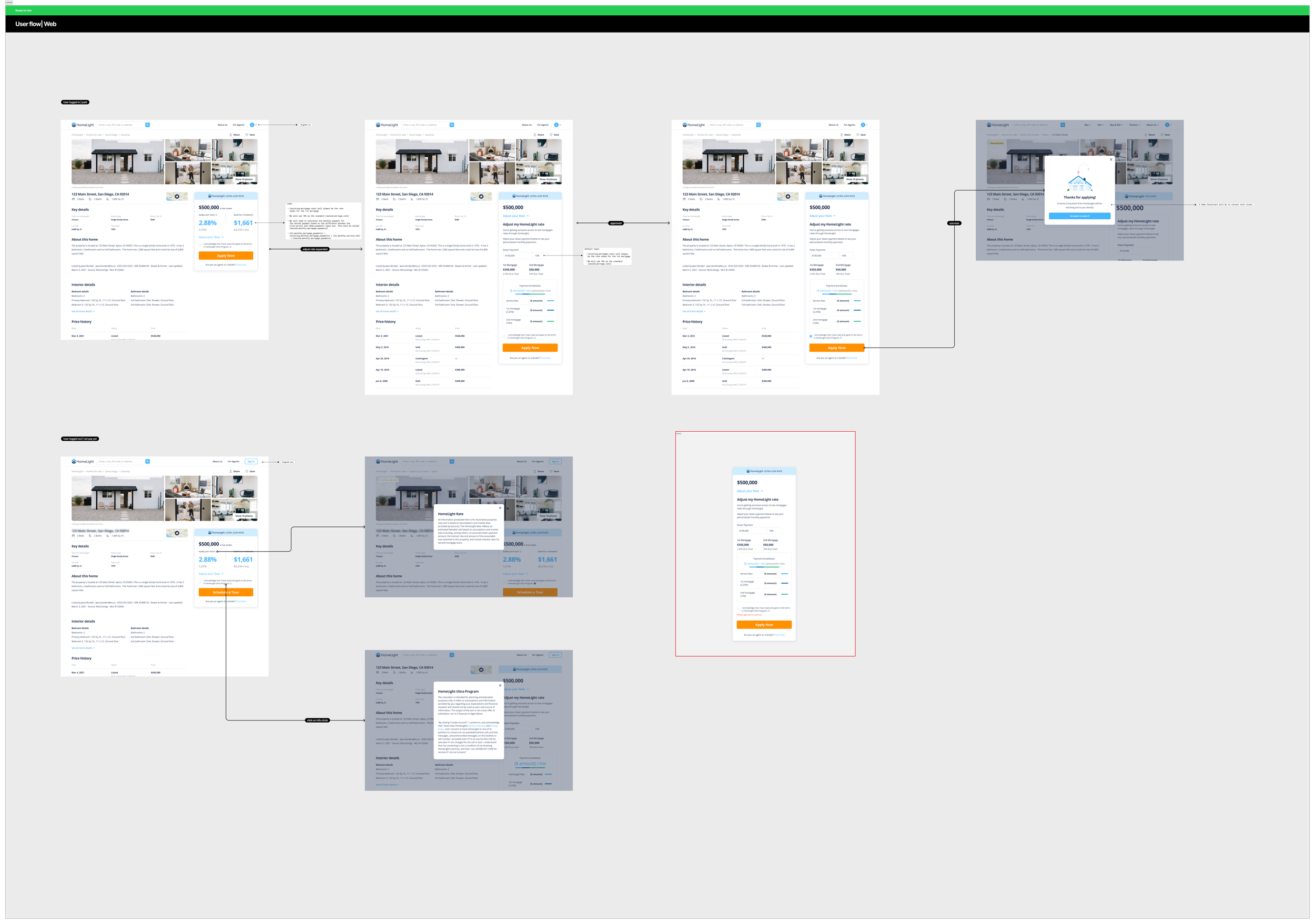
Flow
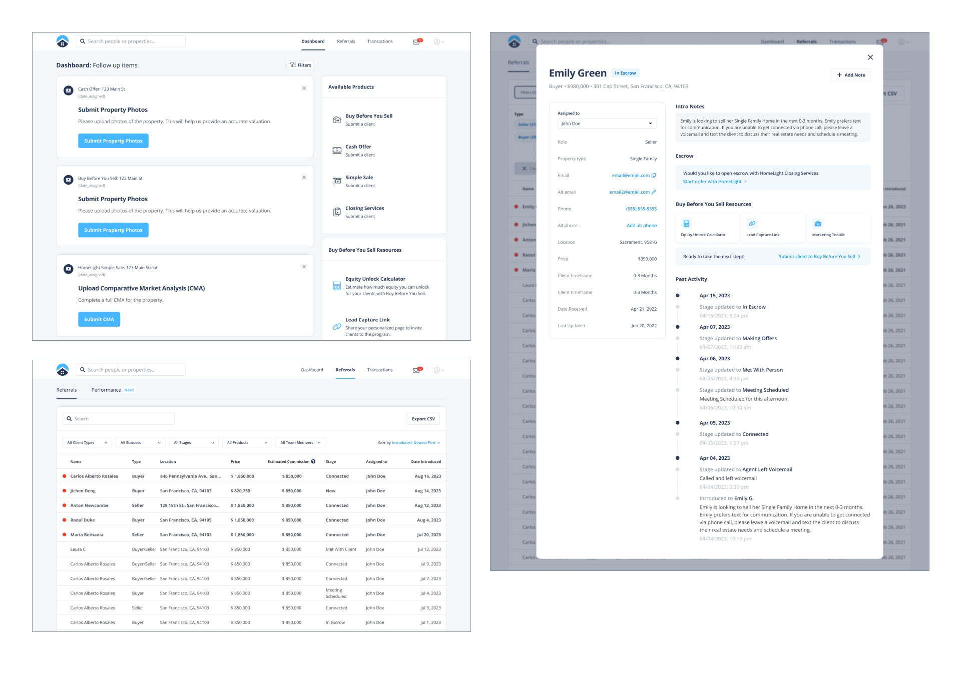
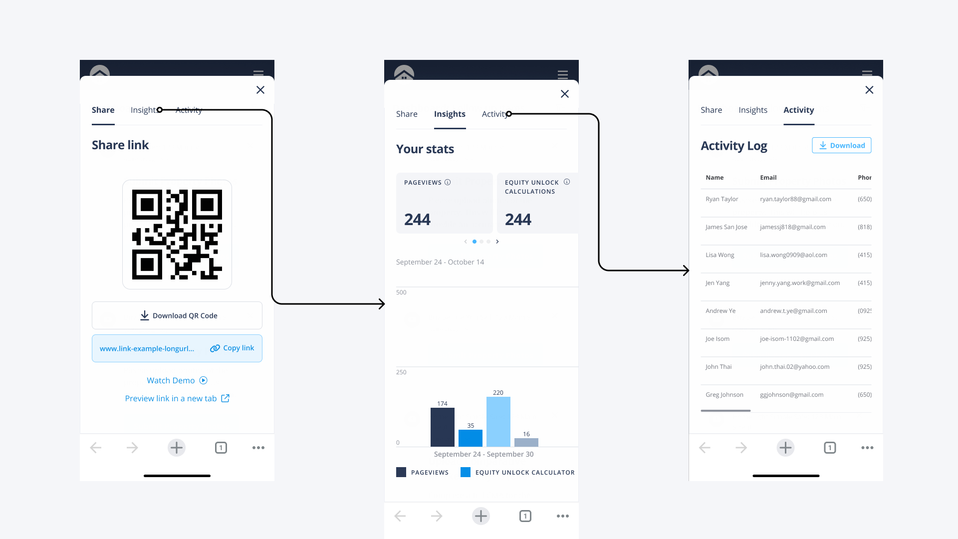
We use components to build screens and user flows.
Files
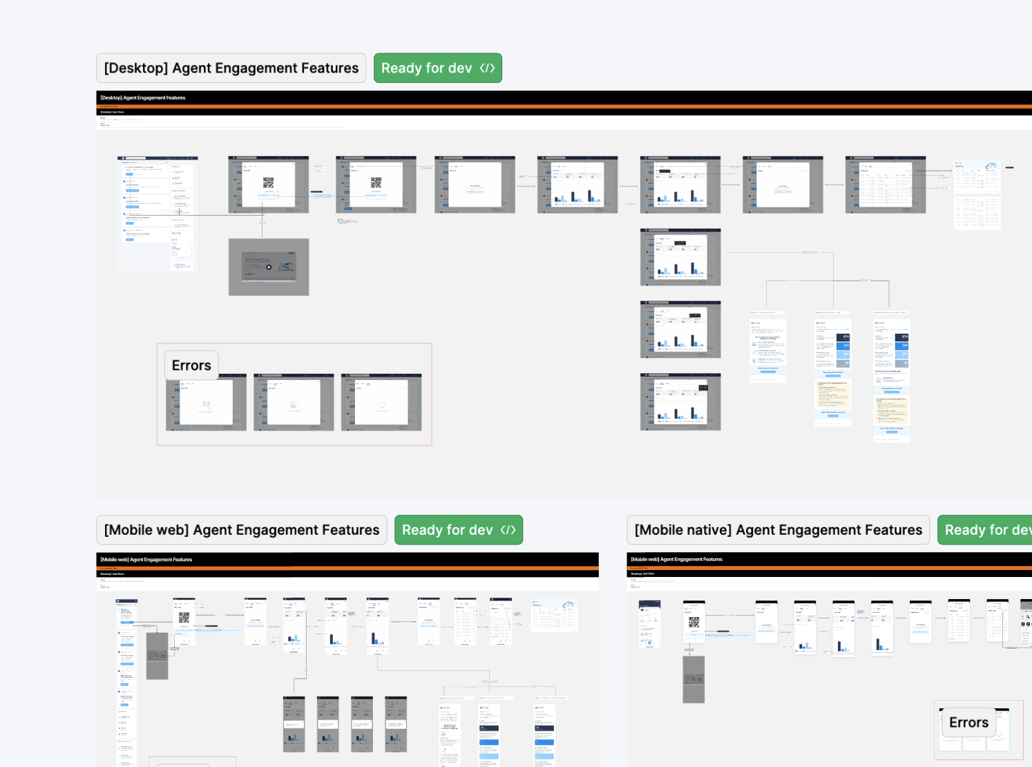
We developed a system of organization for design files so that all stakeholders and engineers could easily find the design.
Results
The design system improved the quality of the UI across all platforms and eliminate inconsistencies.

